logo design
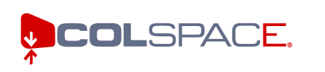
Colspace is a collaboration software company we have been working with for over a year. Their logo was kind of outdated, and we went through a great deal of concepts and ideas before design its replacement.
The main graphic is a stylized computer screen, with the arrows signaling information passing back and forth from the user into the "collaborative space". The font is bold, solid and modern, the stroke thinkness allowing the word to be read 'Col Space'. The coloring of the final "E" tied the whole package together and allows for further branding when the logomark itself is not used.
This font and logomark idea is carried through for the logos for each of colspace's products.
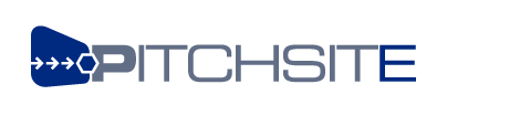
Cortex is the Colspace corporation's main product, an online collaborative workspace. we also use it for our extranet.
see also our screen shots of a variety of user defined 'skins' for the product.

Positive Current is a Utility Sector Corporation that consolidates utility bills from different companies into a personal management system that allows the consumer to shop for and buy all their utility needs through one personalized interface.
The logo had be simple and recognizalbe at the small sizes it might appear in on a printed bill, but still convey an upbeat modern brand. The grid graphic hints at the utilies sector, while the modern font is very clean and powerful without being overbearing.
See also the website archive.
This company came to us with a windowspaint version of their logo, and we whipped it into competitive shape.
The recycling graphic signifies part of the way both their software and business models work to "hook" customers repeatedly. see more on our work for them here.

zoomNYC.com is a brooklyn based electric and human-powered vehicle store. They needed a fun, cool logo that showed of their New York City roots, and would great on stickers applied to the vehicles.

qualityHealth is of our recent launches - qualityhealth.com - a health-oriented marketing and
information site, and after only 3 months is already one of the top five health-related websites.
Our work for them included this simple and clean logotype - a minalmistic approach that has a neutral but corporate feel, and cool peaceful colors.

This rental property broker needed and online identity that could overcome market animosity for rental brokers in the highly competitive market of Manhattan.

Jack Cheevers is an upstate Democrat who entered a crowded race for Governor of New York State, dominated by old school downstate politicians. Cheevers needed an identity that makes a strong visual impact for easy reading on signage, and still imparted a lot of information about the campaign.
Since jdgimzekDesign acted as an all around media cansultant on the campaign, we were able to have input at the earliest stages, including writing the campaign tagline. The tagline reflects Jack's commitment to fight Albany's political machine for the betterment of State Government, and instantly conveys that many of the states woes are firmly rooted in the Capitol.
See also the collateral we designed for the camapign, and the website archive.
environments was an internet branding, strategy and design boutique. There I was responsible for defining corporate identity, look and feel, visual navigation and information architecture for all projects, including the corporate ID for the company. Matt Wislon developed the "e" shape in Illustrator before we decided to take to logo into 3 dimentions.
See also the archived website.
environments was an internet branding, strategy and design boutique. For our web products we needed simpler, more compact logo that still reflected the futuristic brand identity we had developed earlier.
See also the archived website.
back to top
|